Sparkling New User Interface Design!
We have officially launched our new user interface design!
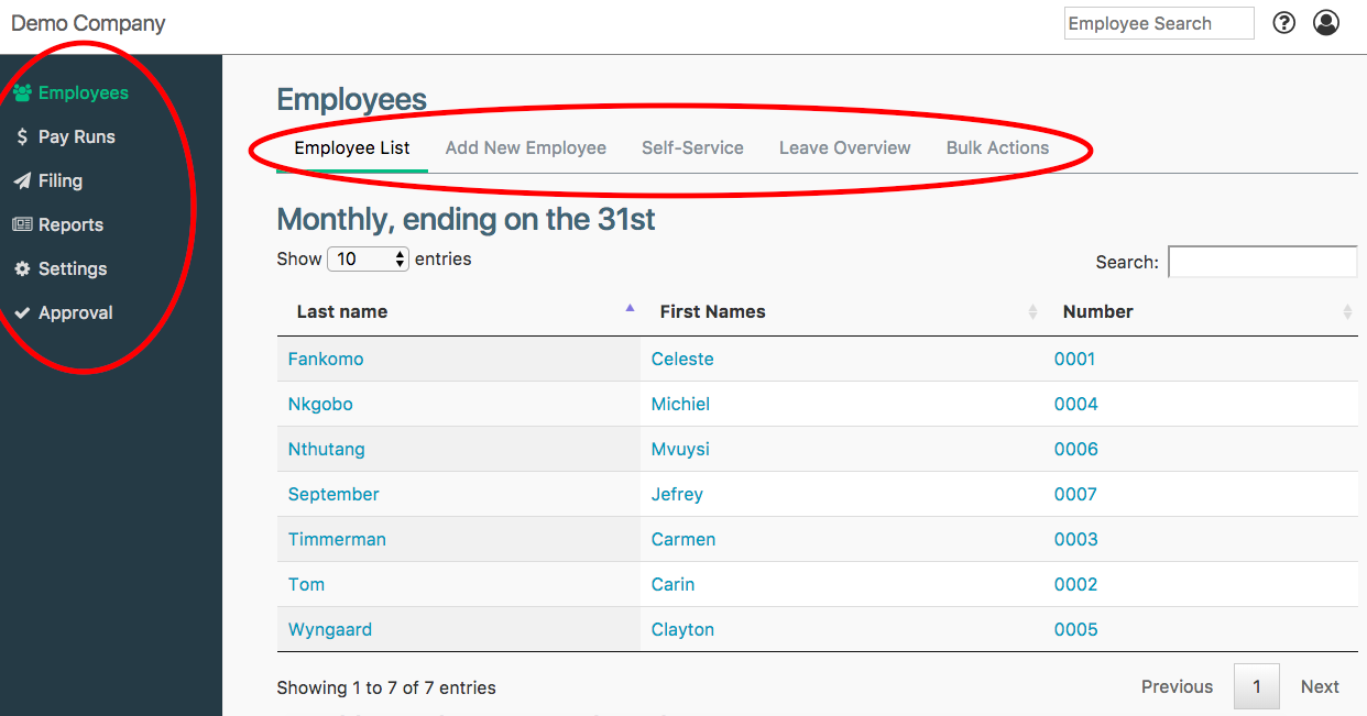
We hope that you like our new look, which is designed to make it easier and quicker for you to find what you are looking for. The new user interface has a fresh and modern look and feel, with more user-friendly navigation. Of course, we haven’t lost sight of your needs and all the usual features and functions that you have come to expect with SimplePay are still there.
Take a moment to explore the new user interface design. You will discover:
Improved Navigation:

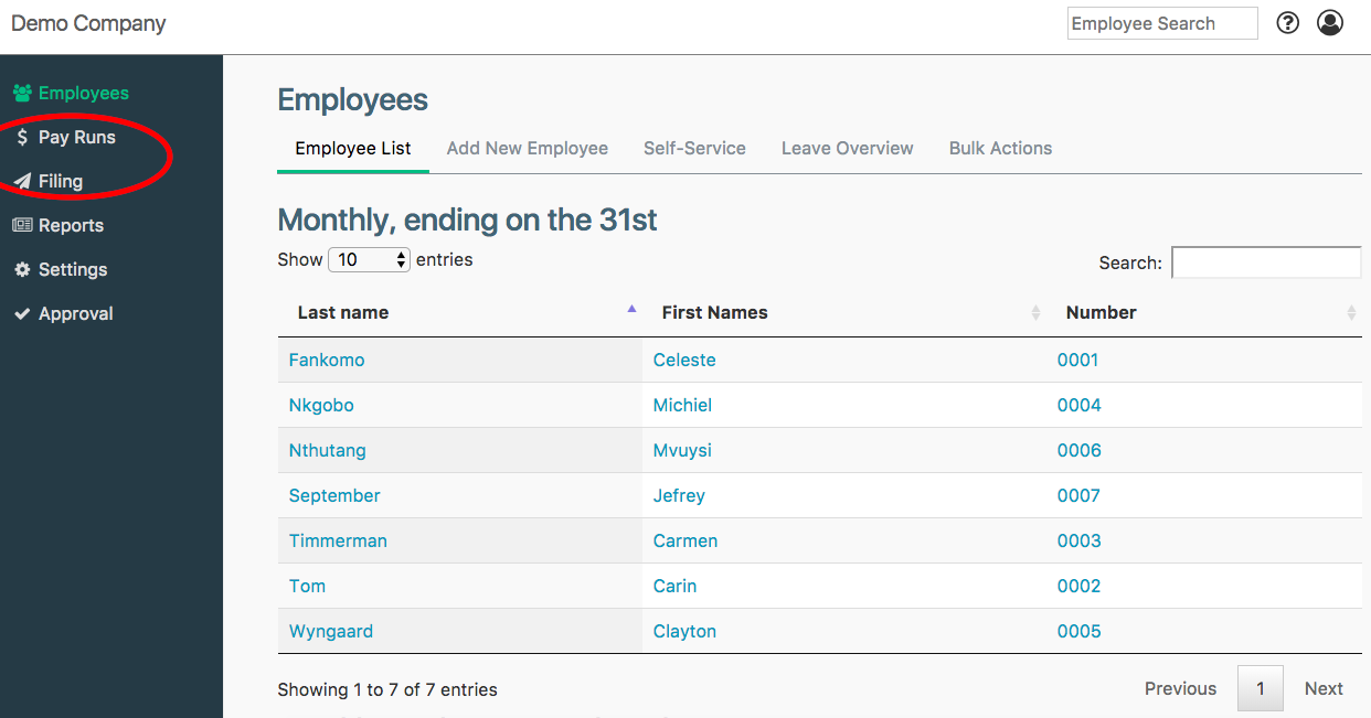
Shortened and more relevant terminology:

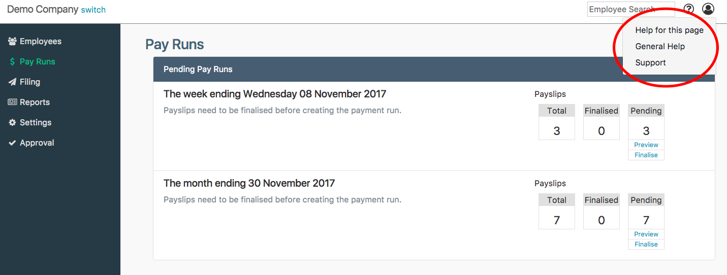
New icons:
- Help for this page: see help pages specifically for the screen you are on (if available),
- General Help: navigate to our help site, where you can browse various topics.
- Support: Contact the Support team or grant them view-only access from this screen.

- Companies: This allows you to add, delete and switch between companies.
- Billing: This shows you all your billing information.
- User Profile: You can change your password here, or switch between roles if you have more than one role.
- Manage Users: This allows you to add, deactivate and manage the users in SimplePay for your company, including changing their permission settings or role.
- Logout: Keep your information secure by logging out of SimplePay when you’re done.
![]()
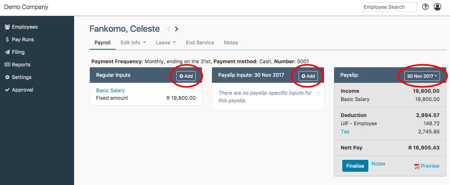
Improved payroll screen:
- The payroll screen is divided into 3 columns, making it easier to do payroll.
- Adding a regular item is now done by clicking on Add next to Regular Inputs.
- Clicking on Add next to Payslip Inputs lets you add a once-off item to this payslip only.
- To view a previous payslip, add a payslip or change payslip dates, click on the date dropdown field next to Payslip in the last column.

Mobile responsiveness:
We hope that you are excited about the new user interface. If you have any questions, please do not hesitate to contact us. Please also let us know what you think of our new look – all comments and feedback are welcome. We would also love to hear suggestions for new information or topics for our help site or blog.
Thank you for your ongoing support.
Team SimplePay

